Share Toxic Trends Mapper
Embed in your website:This web map was designed at the Huxley Spatial Institute at Western Washington University and funded through a grant from the Environmental Council of States. The concept for this web map application was introduced in 2011 in the book, Coming Clean, by Michael E. Kraft, Mark Stephan, and Troy D. Abel. Coming Clean puts forth the idea that information disclosure can be a policy strategy for environmental protection. This web map is designed to use a visual representation of environmental information to provide access to a larger audience of citizens so that they may be able to influence the environmental policy directly affecting their health and the health of their communities.


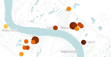
This web map visually represents the chronic health relative risk to communities from toxic chemical industrial air releases and how those potential risks might change over time (figure 1). Facility pollution information comes from the Toxic Release Inventory (TRI) dataset collected by the United States Environmental Protection Agency (EPA). The EPA collects and processes data annually on releases and transfers of certain toxic chemicals from industrial facilities. TRI facilities are depicted as circles with colors that correlate to a risk screening value that is based on modeled output data from the EPA's Risk Screening Environmental Indicators (RSEI) model for assessing TRI data. RSEI is a screening model, not a risk assessment that allows one to make a direct link to a facility’s chemical releases to potential harm being caused to a specific population in a location. As with any model, a number of simplifying assumptions are made.
Circles representing TRI facilities have been classified into 7 sizes and 7 colors to reflect changes in pollution performance and amount so the map user will be able to see if a certain facility has been getting better or worse over time, or, if their neighboring industrial plants are getting safer and cleaner. Smaller circles indicate fewer pounds released; larger circles indicate more pounds released. Each increase in size represents an order of magnitude increase of pounds of pollutants released (Figure 2). Lighter circles represent facility releases that are posing less risk to human health based on the RSEI model risk screening value; darker circles represent polluters who are posing more potential risk. Each shift in color represents an order of magnitude change in potential risk (Figure 3). Gray circles represent facilities that did not report any diffuse or point source air emissions for that year. Users are also able to click facilities to get information about the facility, including emission trends over time, specific chemicals released and related health information, as well as comparisons of the facility to other similar facilities in its state and in the United States. There are currently more than 17,000 facilities reporting to TRI and viewable in the web map for the years 1988 to 2015.